toucan
toucan
high quality push scooters made for discovery
OVERVIEW
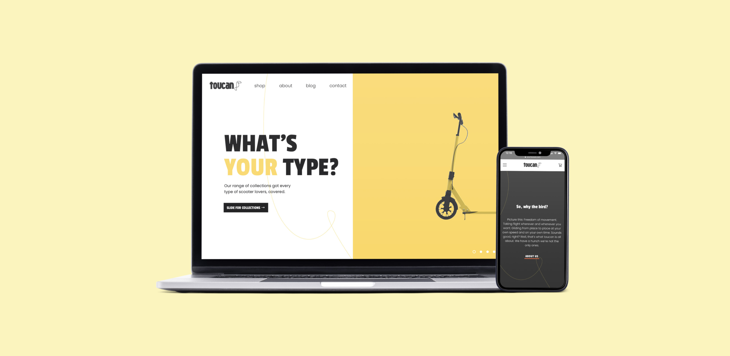
Toucan was born at the height of social-distancing in 2020. Toucan determines to shake some sense into a seemingly monochromatic industry with effervescent colour and liveliness. The brand fuses travel, design and style through push scooters. In a sea of black and white, they wish to become a groundswell of colour and style that the world had been waiting for. I was the designer at Little Vitamin working on the website’s UI, based on the new brand and 3D renders that were created by Vitamin London.

⏤ 00 THE BRIEF
When Toucan first approached the agency, they were known as Push Scooters. Vitamin London transformed this client with a new brand connoting freedom, adventure and vibrant colours: Toucan was born. With Toucan’s stunning new visual identity, we began work on a UI. We proposed 3D modelling of the scooters in order to show-off every detail of their scooters and new look in the best possible light. We then employed the outstanding result throughout the sleek UI, taking advantage of the 360 renders in the product page
⏤ 01 NAVIGATION & COLLECTION HOVERS
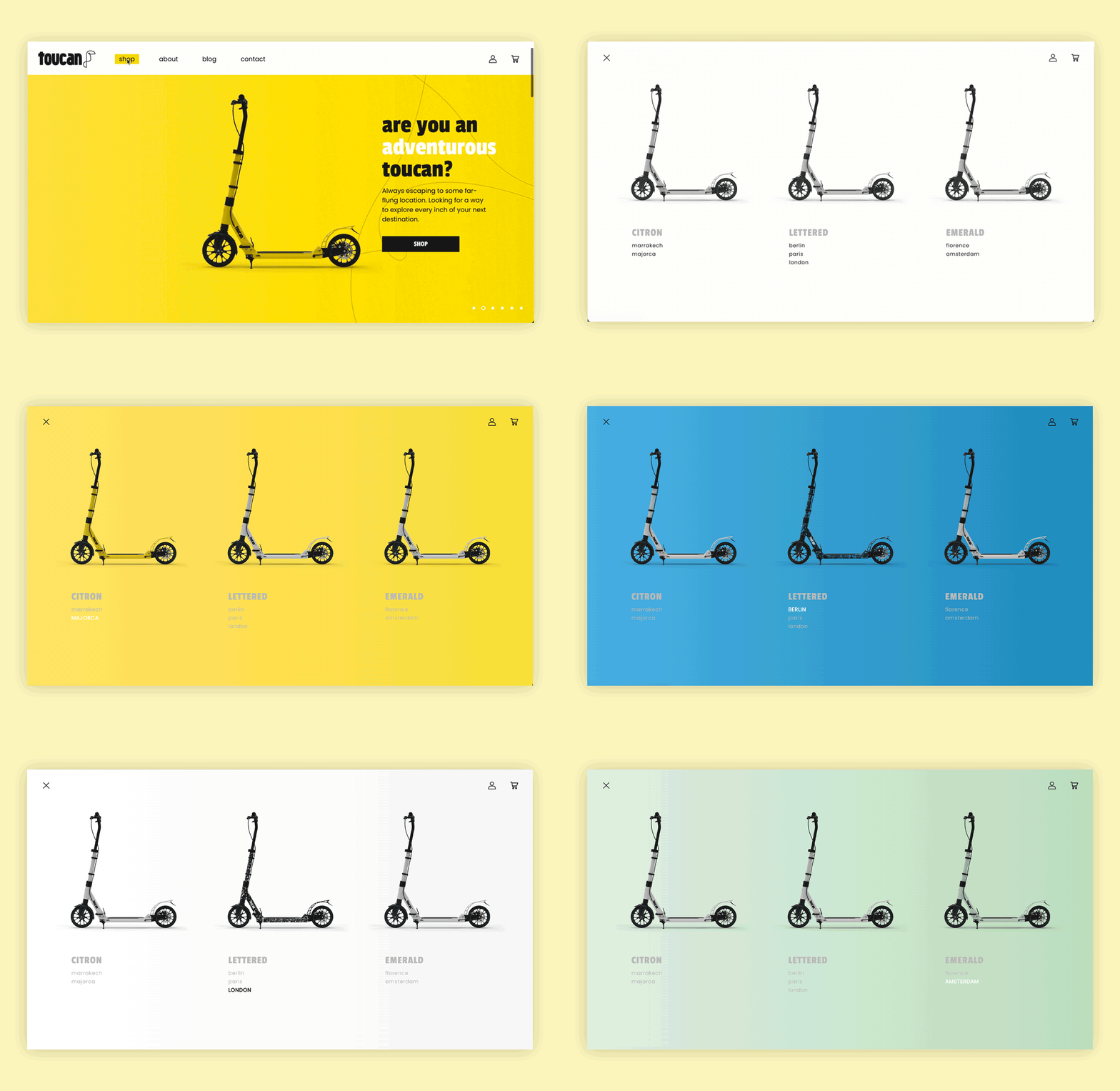
All of the UI has been thought to include as much as possible the brand’s personality into the website through different elements, so that their bold, dynamic, vibrant character could come out everywhere. The first thing we’ve worked on was the immersive megamenu. The default state of the menu is white, which goes for all of the renders as well, but as each scooter has their own persona, they all have a special background colour on hover. The same goes for hovers on collection row.

⏤ 03 HOMEPAGE
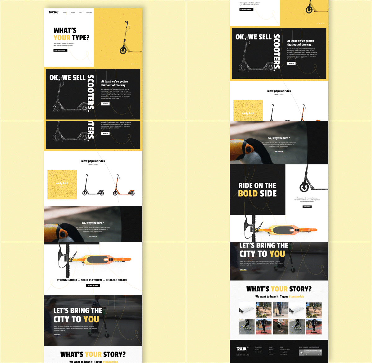
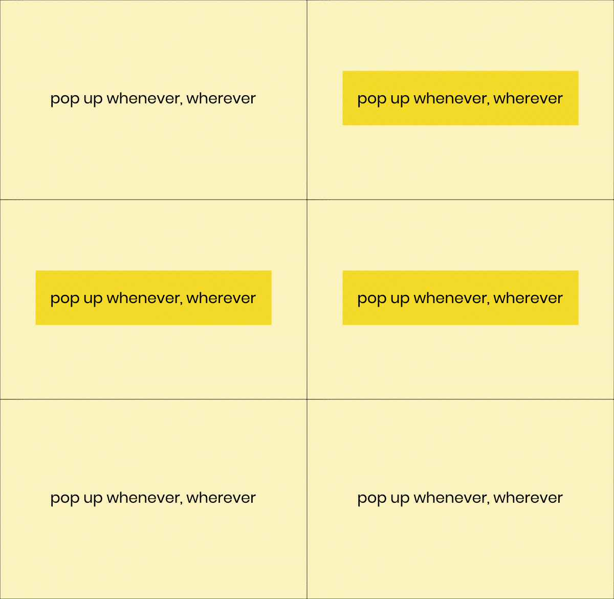
We’ve designed the homepage following the same logic, to include UI elements that represent the movement and vibrant, dynamic characteristics of the brand. For this, we’ve drawn inspiration from the logo – which represents a path – to design the custom social media icons that you can find in the footer, but also including lines in the background of different blocks. The idea was to have connecting lines to all sections, to illustrate the path that people follow with their push scooters. Added to that, the buttons’ hovers pop up from the bottom to speak for the brand’s tagline: Pop up whenever, wherever.
⏤ 04 THE PRODUCT PAGE
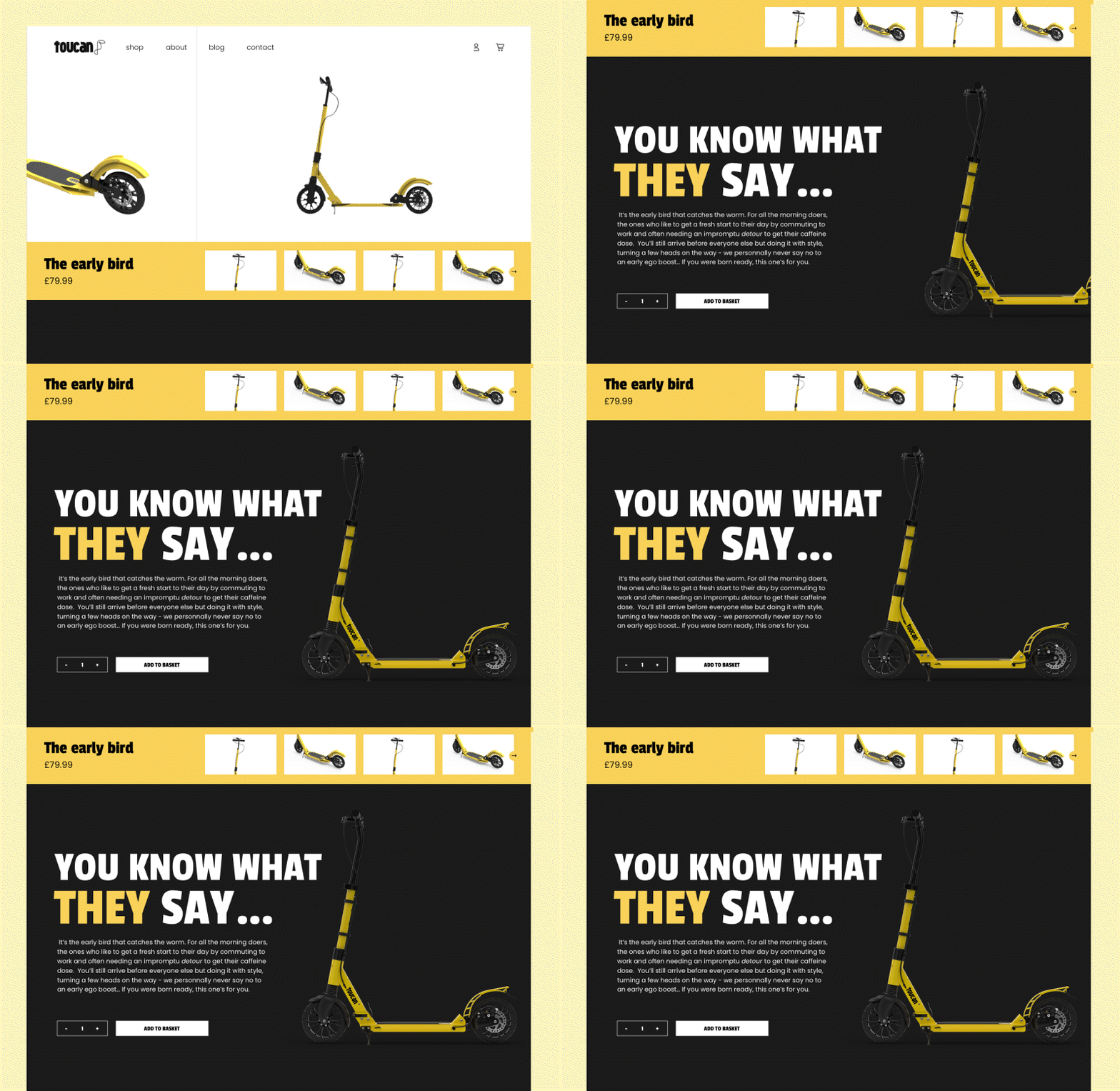
To reflect the fact that each scooter really has its own personality, each product page is an immersion into that scooter’s character. The bold typography and the colours showcase that with a special narrative, and the renders allow to really focus on the specific parts of the product and their high quality.
⏤ 05 THE RENDERS
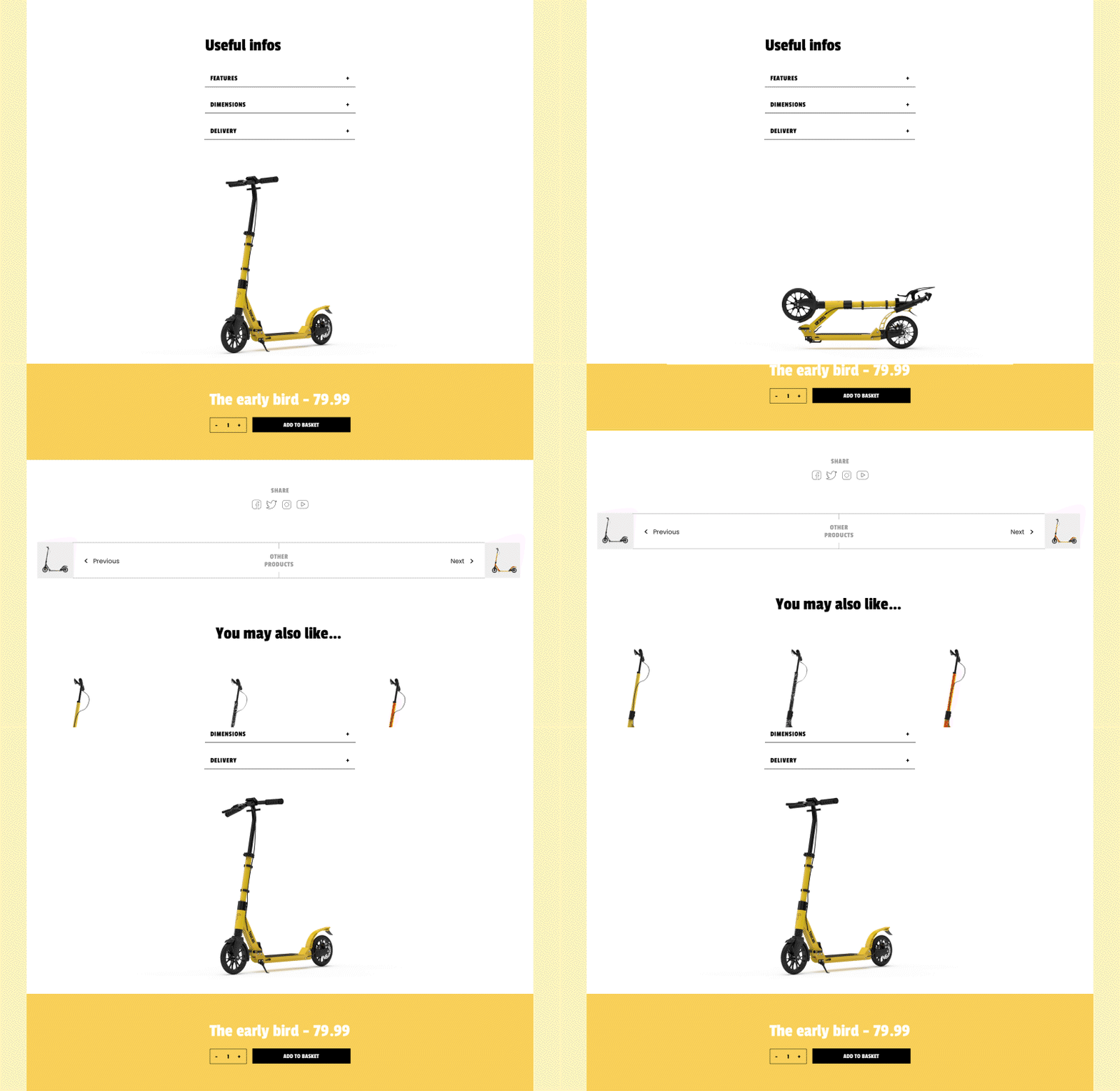
The renders were also given a central role to add movement and animation into the page. All of the custom sections were built on top of the theme’s code – from the scooting in to the folding effect at the bottom of the page, as well as a double scrolling section that focuses on the specs.
