charli
charli
the simplicity of natural, renewable yarns
OVERVIEW
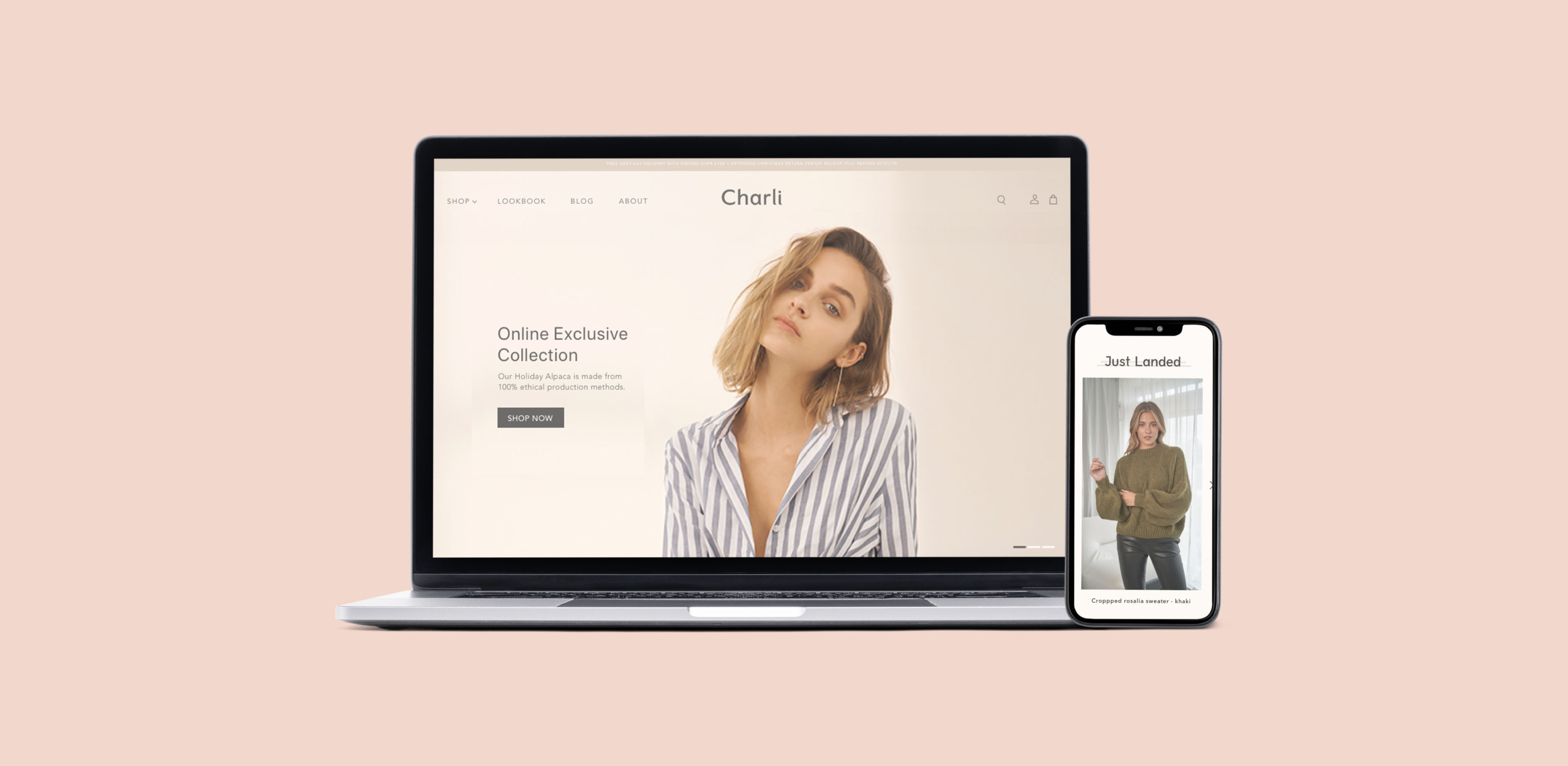
Charli is a fashion brand offering a collection of urban essentials. The brand pays tribute to the simplicity of natural and renewable yarns, making every piece highly wearable and timeless. Their innovative and sustainable production techniques on their core fabrications of jersey and knitwear has inspired a devoted following. What started as a capsule collection of simple luxe basics at the London based multi brand stores, is now a renowned contemporary fashion brand that can be found in selected premium stores throughout Europe, Asia and North America. While working at Little Vitamin, I was the designer who imagined their new website.
⏤ 00 THE BRIEF
The website in its current form had been around for some time, and the client wanted to see the site refreshed, brought up to a higher quality and feel more contemporary. Our brief was to work with the client to redesign and redevelop a homepage, collection page, about and sustainability pages. He needed to highly modernise the main pages of the site, for it to be an enjoyable and pleasant experience to browse and to purchase from.
⏤ 01 THE HOMEPAGE
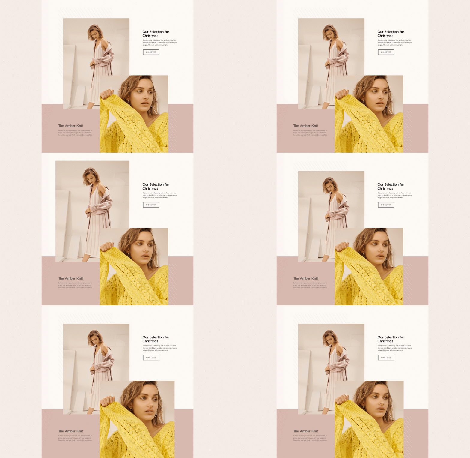
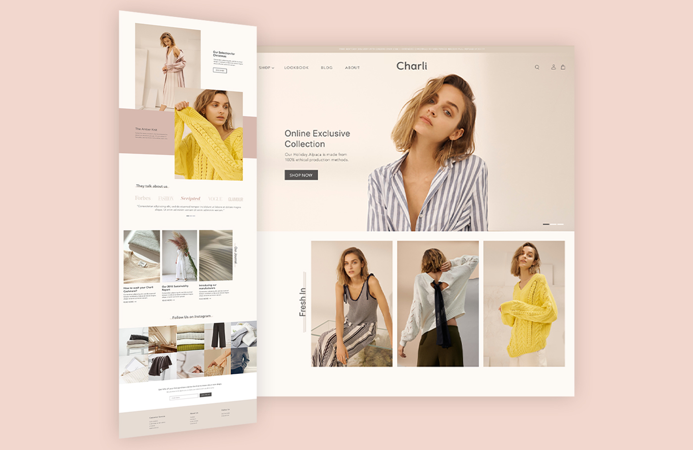
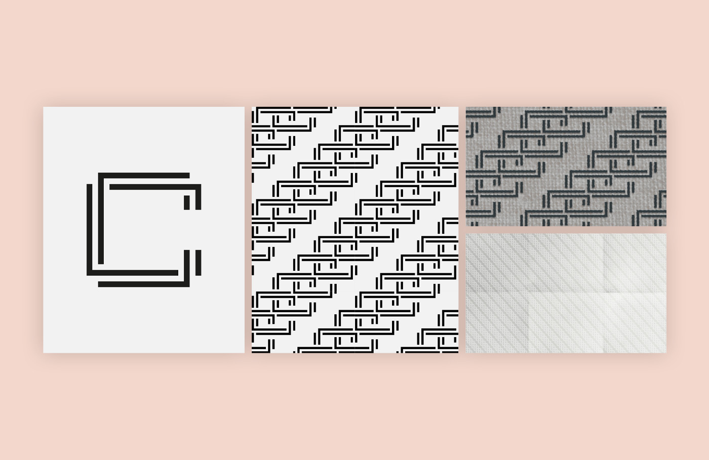
We redesigned and rebuilt the homepage to ensure that the site was easier to navigate, simplified, and the UX enhanced to ensure visitor are engaged by the visual look and feel of the site. We incorporated the secondary mark and pattern to the homepage in different ways. This mark is inspired by the technical aspects of textile design and manufacture, and so I thought this was a nice way to translate the heritage of the brand.
The patterns were included as pictures backgrounds, that would extend on hover because they are clickable collection links. The lines were also used behind main H1 titles.
Furthermore, we’ve built custom buttons to add an interaction element with this special mark. You will see that the scrollers on the slider and testimonials reflects the patterns as well.
⏤ 02 THE COLLECTION & PRODUCT PAGE
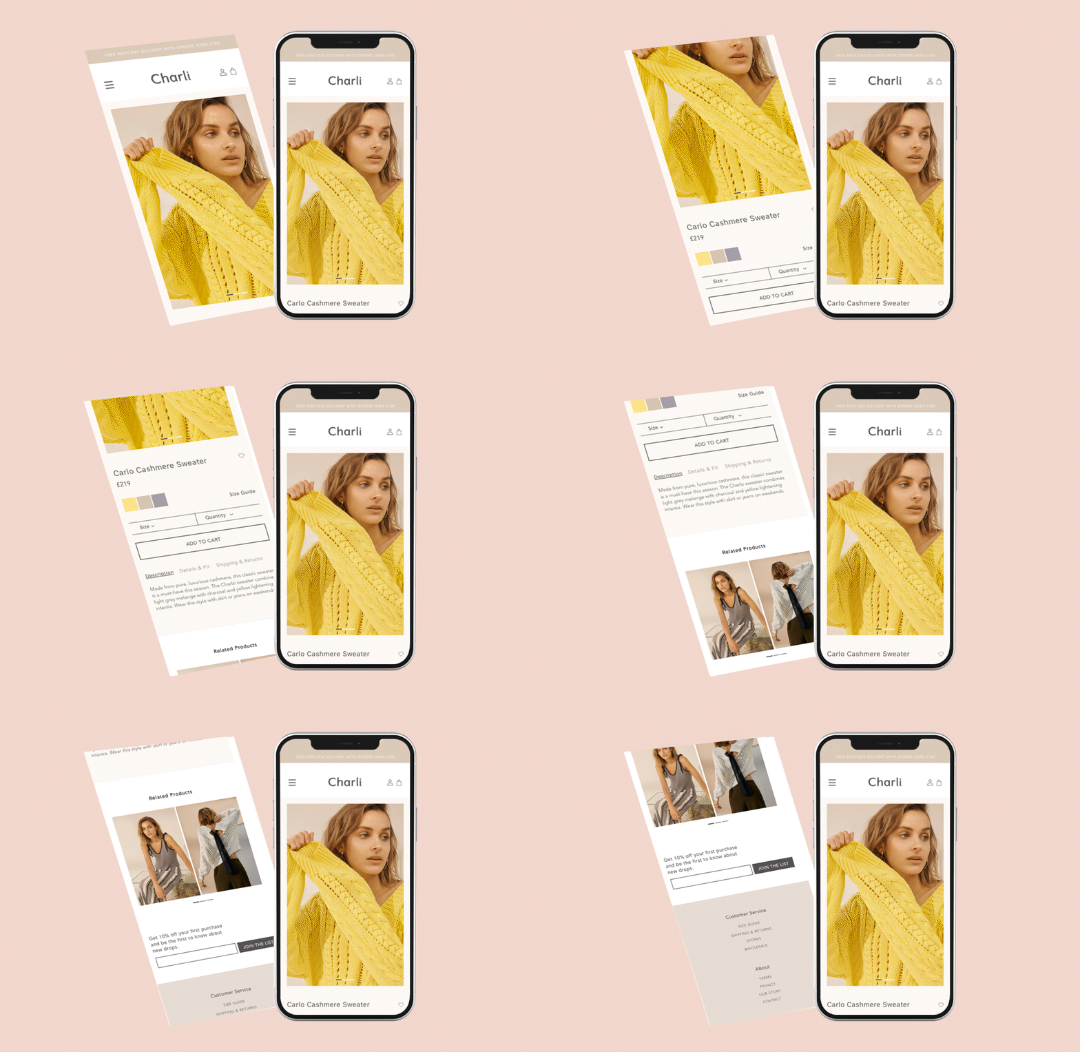
The collection pages were customised to have a top section that includes an image and description text, as well as special hovers on the products. The product page itself was designed to fit the brand of course, and to include all the descriptive elements necessary.
⏤ 03 ABOUT & SUSTAINABILITY PAGES
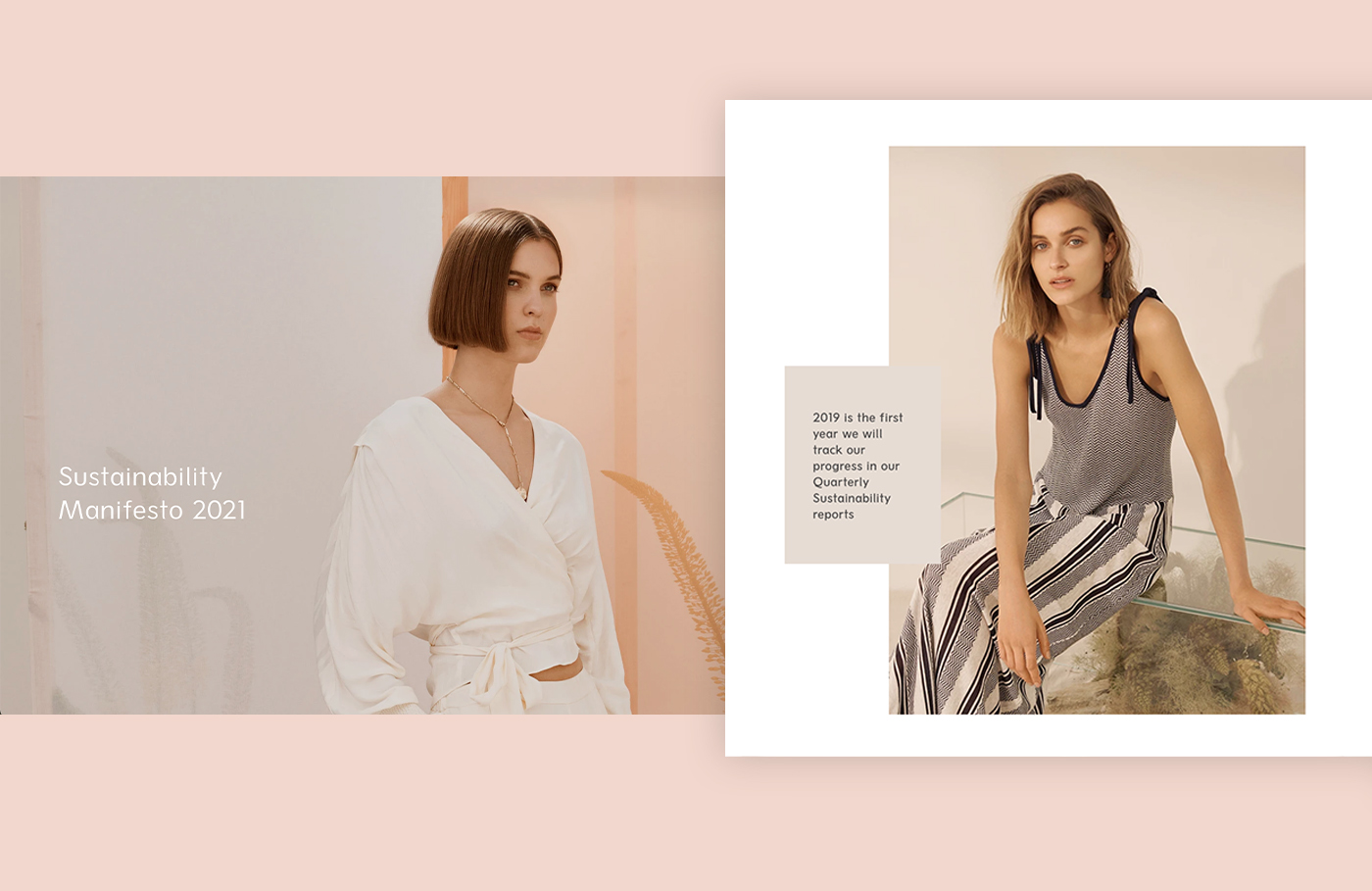
We’ve built the About page with a custom scrollable text section on right and fixed image on the left, and a Sustainability page to best showcase the ecological practices of the brand. It needed to be simple, but still evolved from the basic Shopify template pages.
